


TL;DR
- This week we reviewed a sales page we were building for a client. The products blurred together, and the one that actually pays the bills wasn't the star.
- The research doesn't say more options always mean fewer sales. It says they weigh more when people aren't sure what they want, and first-time visitors often aren't.
- AI reads your offer now too: OpenAI opened a beta space where businesses can load their products into ChatGPT. Hand it a jumble and that's what it gets.
- The fix isn't cutting products. It's deciding which one goes first, which one is the way in, and which ones are extras.
- The one thing today: write your main offer in one sentence and check that it's the first thing people see on your homepage.
The short answer. When a website shows every product at the same level, a first-time visitor has to guess which one is for them. Two meta-analyses summarized by Kellogg Insight find too many options make deciding harder only under certain conditions, and one is not being sure what you want. The fix is ordering, not cutting: one main offer up front, a clear way in, and every extra explained, including in what you give AI.
Let's be clear about what this isn't. It isn't a case for selling just one thing. Plenty of businesses have more than one product, and that's fine. The problem isn't how many you have. It's that someone landing on your site for the first time can't tell which one to look at first.
1. What we saw this week: the product that pays the bills wasn't the star
On Tuesday we sat down with a client, an online academy, to go over the sales page we were building for them. They sell a monthly membership that includes a long course and live classes, plus a second, shorter course for a one-time fee.
In the draft, the two courses sat under the membership in a way that muddied things. Reading it, Naty assumed they were charged on top of the membership. And we'd already built a full funnel for the shorter course that sent people to WhatsApp for a low-price purchase. We built it without the structure clear in our heads, and if it tripped us up, a first-time visitor has it harder.
The conversation surfaced what the page wasn't saying. The membership is the main offer: it keeps the business running month to month and it's what keeps students around. The shorter course makes sense on its own, for people who only want that topic.
A page that won't choose hands the choice to the visitor
What was missing was a pecking order. When the page doesn't choose, the visitor does, with less information than the owner and less time.
The decision was simple to say out loud: the membership goes first, with its own page spelling out everything it includes. The shorter course becomes a standalone product that comes with one week of the membership's live classes, so buyers can see what it's like. Now it stops competing with the main offer and becomes a way into it.
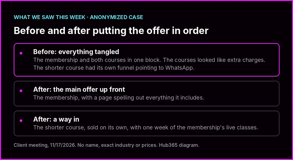
This week's case, with no names or prices. Hub365 diagram.
2. More options aren't always worse, but they weigh on new customers
You've probably heard that too many choices scare customers off. The research is more nuanced than that.
A Kellogg Insight article walks through two meta-analyses: one by Alexander Chernev, Ulf Böckenholt and Joseph Goodman, published in 2015 in the Journal of Consumer Psychology, and one by Blakeley McShane and Böckenholt from 2017. Together they drew on 57 studies across 21 papers. The takeaway isn't that more options always hurt. It's that the effect shows up under certain conditions, and the article names four:
- How hard the options are to compare. It's less about how many there are and more about how complicated it is to choose between them.
- How hard the decision is. Under time pressure, the effect is more likely.
- How well the person knows what they want. The clearer they are, the easier it is to pick.
- Why they showed up. If they came to make a decision, the risk goes up; if they're just gathering information, it goes down.
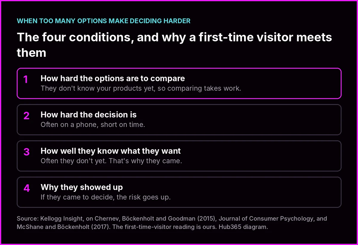
The four conditions from the meta-analyses, seen through a first-time visitor's eyes. Hub365 diagram.
The first-time visitor is exactly the one who doesn't know what they want
Run those four conditions past someone hitting your site for the first time. They don't know your products, so comparing them is work. They probably came in on a phone, short on time. And they often don't know yet what they need; that's why they're there. Your regulars don't have this problem, because they already know what they buy from you. Your homepage isn't for the customer who already knows you. It's for the one who doesn't know what to ask for yet.
3. AI reads your offer now too
This mattered before. This week it matters a bit more.
According to an IT Brief report dated November 11, OpenAI introduced Businesses in ChatGPT in beta. It includes a dashboard, Business Hub, where an eligible business can claim and verify its presence, update its details, and add products with pricing and availability. It also includes Business Agents, which answer users with information the business supplies; for now they're limited to eligible US ecommerce and online service businesses.
On Thursday we also covered how Gemini can now call businesses to book on someone's behalf. More and more, people are asking an assistant to compare and choose for them.
Whatever you don't put in order reaches the assistant just as tangled
We don't know how ChatGPT orders products in its answers, and the article doesn't say. What is clear is where part of the information comes from: what you give it; the rest comes from what it finds online, your site included. If your site makes a standalone course look like an add-on, that's what there is to read. If nothing anywhere calls your main offer the main offer, nobody is going to present it that way for you. It's the same logic as the outdated promises your site keeps repeating: AI repeats what it finds.
4. Your offer in one sentence
Here's today's check. Four questions, each fixable in a minute or less.
1. Can you say your main offer in one sentence? Fix: write it now in this shape: "For [who], [what they get], [how they pay]." If it takes two sentences, you haven't picked yet.
2. Is it the first thing people see on your homepage, with its own button? Fix: open your site on your phone. If the first thing on screen isn't that offer, jot down what needs to move. The change may take longer; the decision doesn't.
3. Does each secondary product say what it is in relation to the main one? Fix: add one line under each. "Start here before you subscribe," "For people who only want this," or "For a one-off question." Three labels cover it: a way in, a standalone product, or an extra.
4. Do your Google profile, your bot and anything you load into ChatGPT say the same sentence? Fix: copy the sentence from question 1 into your Google profile description and your bot's instructions, which is what your agent answers when nobody's watching. If you use Business Hub, make it the basis for what you load there.
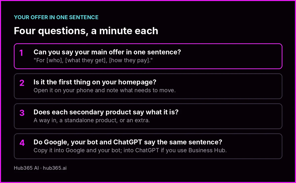
The full check. Copy it by hand or print it.
It works the same for any business, ours included, and it makes you choose.
5. Putting your offer in order doesn't mean promising more
One caution, which also came up in the meeting. Putting one offer up front makes it tempting to inflate it. In this client's case, their industry has rules about what can be promised, and the call was to sell what's actually delivered (the training and the academic endorsement), not an outcome.
The sentence that goes first should be the easiest one to keep
That holds for any business. Describe your main offer by what the customer gets, not by what you hope they'll achieve. It's easier to deliver, easier to verify, and harder to take out of context when someone, a person or an assistant, sums it up.
The meeting where nobody said "this is the main one"
The one thing today
Just one: your offer in one sentence.
- Write your main offer in the shape "For [who], [what they get], [how they pay]."
- Open your homepage on your phone and see whether that's the first thing on screen.
- If it isn't, note what needs to move and who you'll ask to do it. No redesign needed today.
To close
Plenty of the websites we review don't have a product problem. They have an ordering problem. The owner knows exactly what the main thing is, and the site buries it among everything else.
Getting your offer in order doesn't take a full redesign to start. It takes one sentence, and the decision to put it first. Everything else falls into place around it.
Want to look at your homepage and your main offer together?
Thanks for spending another week with us. If you try the one-sentence exercise, tell us how long it took you to write it. We'd love to hear.
Keep reading
- Your website still promises things that stopped being true, and AI repeats them - what AI finds on your site
- Google's AI can now call your dental office to book - the assistant that chooses for your customer
- Decide or repeat: sort your tasks before you automate anything - last Friday
- Kellogg Insight: when consumers feel overwhelmed by their options - the research
Sources
- Kellogg Insight, "When Are Consumers Most Likely to Feel Overwhelmed by Their Options?", October 3, 2017, on Chernev, Böckenholt and Goodman (2015), "Choice Overload: A Conceptual Review and Meta-analysis", Journal of Consumer Psychology 25(2), and McShane and Böckenholt (2017), Psychometrika - https://insight.kellogg.northwestern.edu/article/what-predicts-consumer-choice-overload
- IT Brief UK, "OpenAI launches ChatGPT Business Hub for companies", November 11, 2026 - https://itbrief.co.uk/story/openai-launches-chatgpt-business-hub-for-companies